

The
POS Sales Reportshows you what sells, when, and what’s coming. Four tabs cover the item detail, the daily view, the hourly view and a production forecast. You can compare two periods and export your data. Here’s how to put it to work.
What you’ll need
- The POS add-on enabled on your business.
- Permission to view the POS sales report.
- A history of POS sales (especially for the hourly view and the forecast).
Steps
- Open the report and read the detail
From the menu, open the
POS Sales Reportpage. TheDetailtab shows four summary cards —Total Quantity,Sales Count,Average ReceiptandTotal Revenue— then a per-item table (Item Name,Total Quantity,Sales Count,Last Sale Date,Price,Total Revenue).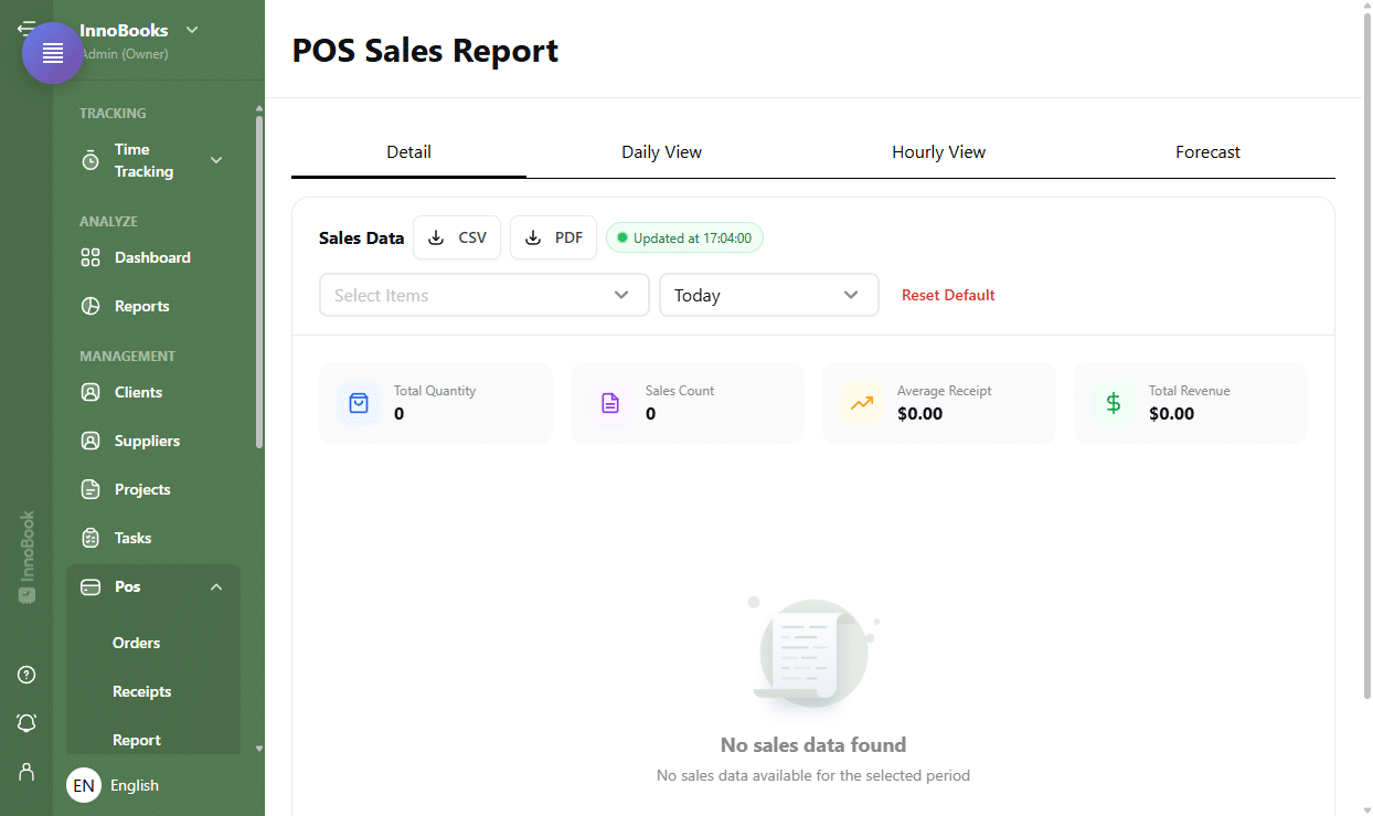
The Detail tab with the summary cards and the per-item sales table. - Choose the period and items
Use the filter bar: select one or more items, then a period —
Today,This month,This yearorCustom(with a date-range picker). TheResetbutton restores the defaults. Export the table with theCSVandPDFbuttons. - Explore the daily view
Open the
Daily Viewtab (“Sales by period”). Set theGranularity(Auto,Day,Week,Month) and theMetric(QuantityorRevenue). There is no selectableHouroption: hourly detail appears on its own whenAutois chosen over a short period (a “(Hour)” note then shows next to the title). You get a bar chart, aTop 5 by revenuedonut, a sort control and a clickable legend to hide items. Turn onCompareand pick aPeriod Bto overlay two periods. - Explore the hourly view
Open the
Hourly Viewtab (“Sales by hour”). Pick a day, filter by items and byMetric. Turn onCompareto set two days against each other and spot your peak hours. - Check the forecast (Optional)
Open the
Forecasttab (“Production forecast”). Choose aHorizon(Next week,Next monthorCustom) and aHistory usedrange. The forecast estimates quantities per item and per day, with a confidence range, factoring in public holidays and weather. A diagnostic table shows the raw history per weekday.

Tips & edge cases
- The
Average Receiptis the average revenue per sale over the filtered period. Comparemode overlays aPeriod Aand aPeriod B(or two days in the hourly view) to measure a change, with a per-item variation percentage.- The forecast improves with history: a warning appears when history is low (under 8 weeks) or moderate. Weekdays with no sales are highlighted in the diagnostic.
- The per-day context strip flags public holidays and shows forecast temperatures and rain, which influence the forecast.
- The
Updated attimestamp tells you how fresh the displayed data is.
Frequently asked questions
How do I compare two periods?
In the Daily View tab, turn on Compare and pick a Period B: the chart overlays Period A and Period B and shows the per-item percentage change. In Hourly View, you compare two days instead.
What is the production forecast based on?
On your sales history (the History used range you choose), adjusted for public holidays and weather. It suggests per-item, per-day quantities with a confidence range. The longer the history, the more reliable it is.
How do I change the chart’s level of detail?
In the Daily View tab, set the Granularity to Day, Week or Month (or Auto, which shows hourly detail “(Hour)” over a short period), and choose the Metric Quantity or Revenue.
How do I export the report?
In the Detail tab, filter the period and items first, then click CSV or PDF next to the Sales Data heading.